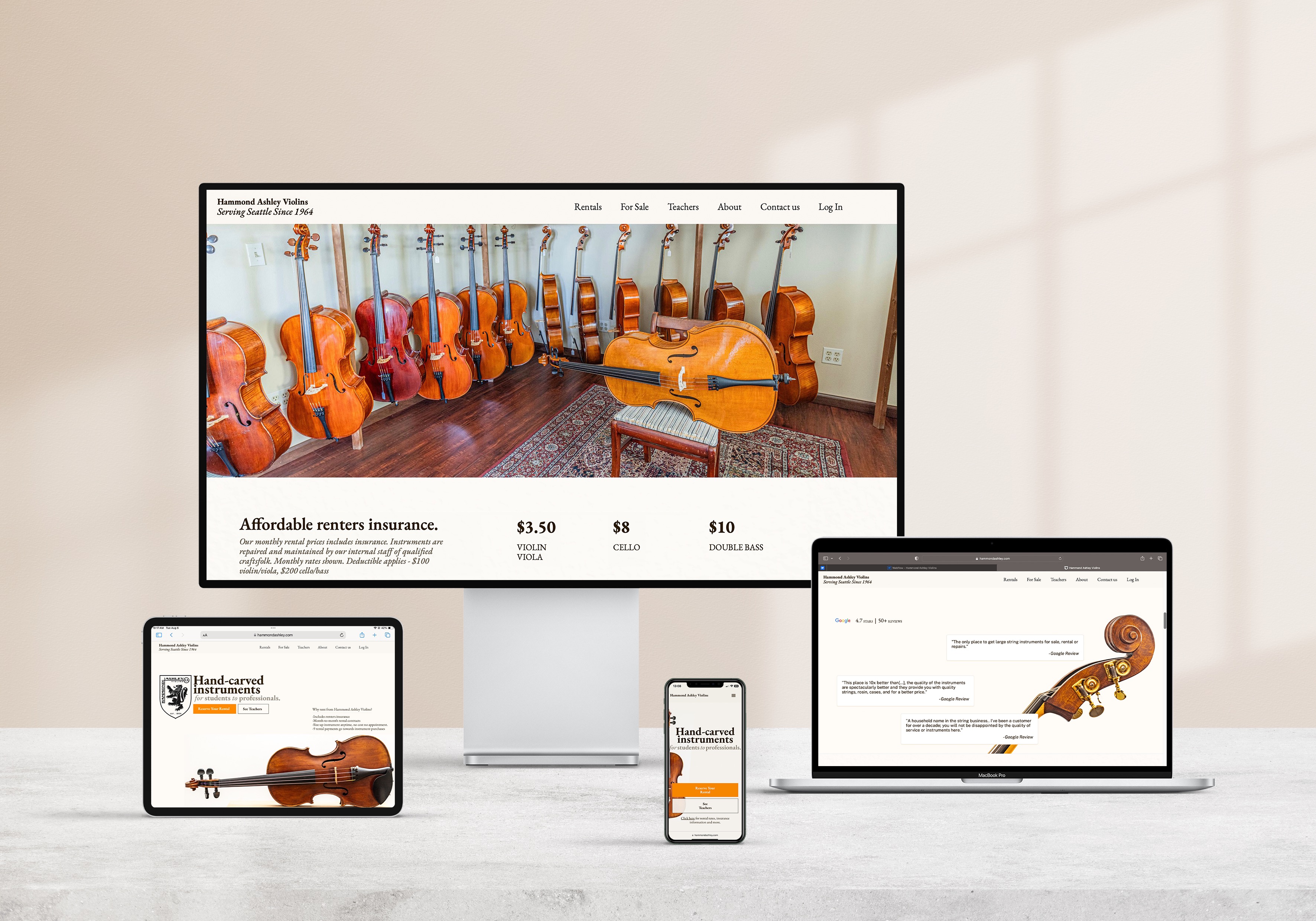
Hammond Ashley Violins

A responsive website for Washington’s #1 string rental business. See the live website.

Services

UX Research, UX Design, UX Copywriting, UI Design, Front-end Development

Platform

Webflow

timeline

October '23 - June '24

Outcomes

+20% conversions
+108% positive interactions
+77% clicks

PROJECT BREAKDOWN

Hammond Ashley Violins is Washington’s #1 string rental business, used by fifteen hundred parent’s each month. The initial site had reached it’s limits, and they wanted a modern responsive website that could direct parents to rentals and teachers.

01 intro

When your primary user group is families, your priority is to make it easier for busy parents to

a. Easily get the information they need 

b. Make the best decision for their kids 

c. feel at ease in the process.

Here is how I made

01 infield research & data synthesis

1.1 Surveys & testing
In order to better understand the clientele I was designing for, I spent an afternoon in the violin shop. I wanted to further understand the initial rental process and the experience of Hammond Ashley's clientele. I gathered data by interviewing customers and watching participants use the initial site.
"Tell me about the last time you rented something.. what was the process like?"
"Tell me about a time you struggled to complete a form... What are frustrations that you ran into?"
"Have you ever switched how you rent an instrument because of the process?"
"How would it work if it were magic?"
"It would be .. [a] straight forward and streamlined process. Nothing hidden.”"
"Be as transparent as possible with taxes and fees, even though it might scare people away."
8/10
Participants were willing to spend at least 15 minutes researching the product to get the best deal possible.
9/10
Participants actively sought out product recommendations.
1.2 user archetypes
Synthesizing the data I collected into archetypes helped me understand the goals, needs, pain points and opportunities presented by each customer: Committed Student Parents, Adult Learners and First Timers.

This was valuable fuel for future design decisions. However, it also functioned as impactful supporting evidence when pitching design ideas to my client.
Archetype for a committed parentr: 12.5% of users.Archetype for adult learners: 22.5% of users.Archetype for a first time renter: 65% of users.Pie chart describing three user Archetypes: 1. First time renters 2. Adult Learners 3. Committed Parents.
1.3 User journey maps
I took the data synthesis process a step further by charting out each archetype's experience while navigating the home page. This allowed me to

1. Gain clarity on the goals I was designing for
2. Prioritize the needs of all three customers
3. Communicate these needs, with quality supporting evidence, to my client
During my initial research, I compiled all my findings into a mind map. I view mind maps as vision boards with words—they help shape and refine the brand and design ideas based on the material gathered for the project

This was not a deliverable for the client; but a creative framework I used to stay organized.
A mind map displaying the designers spider-web thought process on the values, mission and vision of the company.

02 IA & the NAV BAR

Initial analysis of the site's Google Analytics revealed high drop-off rates, with users leaving within an average of seven seconds. The top header navigation bar, crucial for user pathways, seemed underutilized. Based on data and user interviews, I believed enhancing the nav bar could significantly improve user engagement and site performance.

03 Responsive by design

By rethinking the design from the smallest screen sizes to the largest, the final result is a system that prioritizes information architecture from my research, accessibility while maintaining the integrity of the business’s branding values. Responsiveness was my top priority, as 70% of users access the site via mobile devices.

04 A story to tell

When the owner of the shop handed me a box of photos and articles from the shop's dusty attic, I knew there was a story to tell. It was a wonderful opportunity to capture the history and essence of this family-owned violin shop.

05 the results are in.. it's working

Click through rates have been steadily rising since the site was published in May 2024. According to the analytics, customers are loving it.

+108%

Clicks

+77%

Positive Interactions

+20%

Converstions